If you've ever tried to style a select dropdown you know the frustration. Because they are styled by the browser, they can be tricky to manipulate. In this post, I'll show you how to easily style a select dropdown.
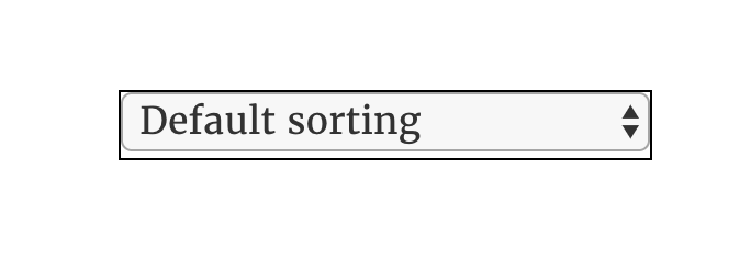
My example today will come from a select dropdown found on my own shop page. It looks like this, a basic Chrome select element:

A real beauty, eh? We need to open it up a bit, replace that down arrow, and take control back from the browser.
Here's the code for the select element above:
<form class="woocommerce-ordering" method="get">
  <select name="orderby" class="orderby">
    <option value="menu_order" selected="selected">Default sorting</option>
    <option value="popularity">Sort by popularity</option>
    <option value="rating">Sort by average rating</option>
    <option value="date">Sort by newness</option>
    <option value="price">Sort by price: low to high</option>
    <option value="price-desc">Sort by price: high to low</option>
  </select>
  <input type="hidden" name="paged" value="1">
</form>
And here's the plan…
How To Easily Style a Select Dropdown
Step 1: Create a border AROUND the select element.
First, we want to create a border around the element. So looking at our code, this would be the form element. My CSS would look something like:
form.woocommerce-ordering {
  border: 1px solid black;
}
..resulting in:

Step 2: Remove the border of the select element itself
Now remove the border from the actual select element, and align vertically:
form.woocommerce-ordering select {
  border: 0;
  vertical-align: middle;
  background: transparent;
}
…resulting in

Looking a lot better!
Step 3: Remove and Replace the arrow
Now to get rid of those double arrows. First, remove these by adding to your select CSS:
form.woocommerce-ordering select {
  border: 0;
  vertical-align: middle;
  background: transparent;
  -webkit-appearance: none;
  appearance: none;
  padding-left: 5px;
}
Giving us this:

In order to add a new arrow, we will need to use a pseudoelement. If you use FontAwesome, you can substitute that Unicode (it will look much better). I don't use FA, so I'm going to use another. Also, you may have to adjust a bit to best fit your own scenario. Here's the CSS:
form.woocommerce-ordering:after {
  content: '\2304';
  font-size: 30px;
  line-height: 23px;
  padding-right: 2px;
}
And we end up with:

Conclusion
And that's a simple way to style a select dropdown. Get creative with it now. Curve the border a bit with border-radius. Give it a box shadow. It's all yours now, not the browser's!!

This page may contain affiliate links. Please see my affiliate disclaimer for more info.


