What's up with that nasty blue checkbox in Gravity Forms? I don't like it.
Your browser will style it according to its own default. We need something else, right?
In this post I want to give you a little CSS to create a custom checkbox in Gravity Forms by completely replacing this browser-default box:

with something like this box:

Here's how:
Video Tutorial
If you prefer not to watch the video or need further instructions you can read below:
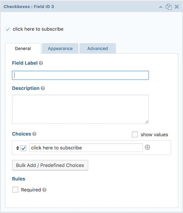
1. Create a Form and add a Checkbox
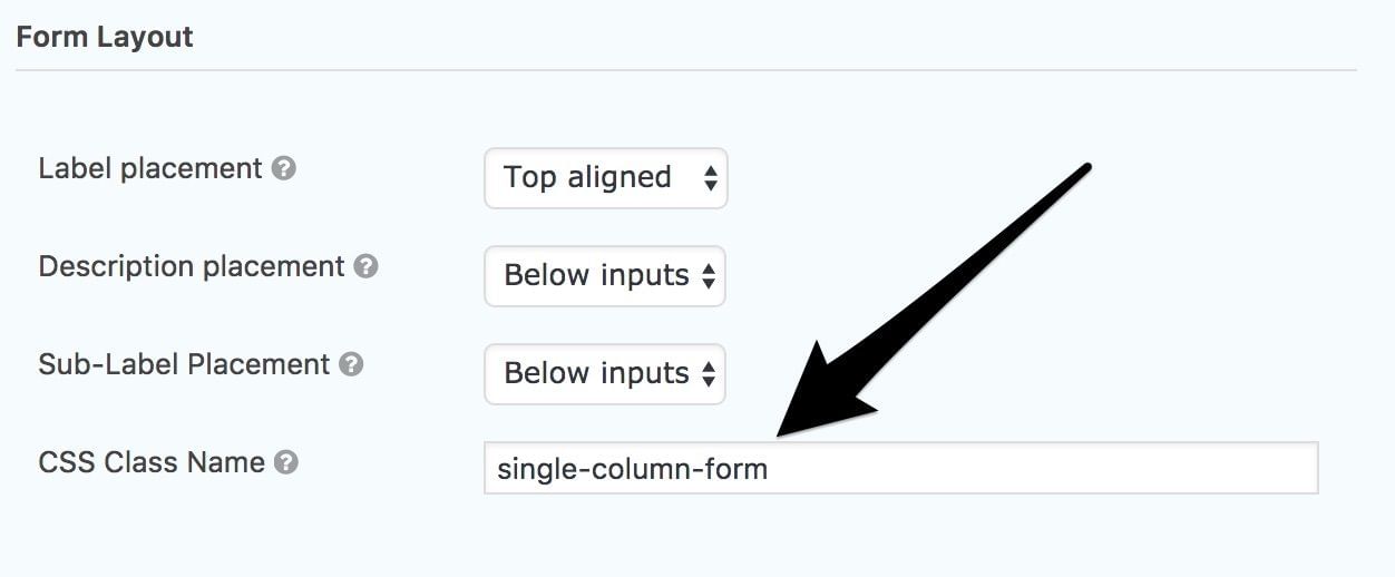
2. Add the class .single-column-form to the entire form.
In the Form Settings enter in the CSS Class Name single-column-form. Now this technically could be anything, but in order to work with the provided CSS, stick with this.
3. Enter the following CSS code.
This code removes the default box and creates an entirely new one, allowing you the ability to tweak as desired. Just copy and paste it into your stylesheet.
/*Default styles for Gravity Forms single-column-form class*/

.single-column-form ul.gfield_checkbox li input[type='checkbox']:checked + label,
.single-column-form ul.gfield_checkbox li input[type='checkbox']:not(:checked) + label {
  margin-left: 19px;
  font-weight: 400;
  font-size: 15px;
}

/*Custom subscribe box for .single-column-form class*/
.single-column-form [type='checkbox']:not(:checked),
[type='checkbox']:checked {
  position: absolute !important;
  left: -9999px;
}

.single-column-form [type='checkbox']:not(:checked) + label,
[type='checkbox']:checked + label {
  position: relative !important;
  padding-left: 1em !important;
  cursor: pointer !important;
}

.single-column-form [type='checkbox']:not(:checked) + label:before,
[type='checkbox']:checked + label:before {
  content: '';
  position: absolute;
  left: -17px;
  top: 2px;
  width: 1.3em;
  height: 1.3em;
  border: 2px solid #ccc;
  background: #fff;
  box-shadow: inset 0 1px 3px rgba(0, 0, 0, 0.1);
  padding: 2px;
}

.single-column-form [type='checkbox']:not(:checked) + label:after,
[type='checkbox']:checked + label:after {
  content: '';
  position: absolute;
  width: 11px;
  height: 11px;
  top: 6px;
  left: -13px;
  font-size: 1.3em;
  line-height: 0.8;
  background-color: #c4732d;
  transition: all 0.2s;
}

/* checked mark aspect changes */
.single-column-form [type='checkbox']:not(:checked) + label:after {
  opacity: 0;
  transform: scale(0);
}

.single-column-form [type='checkbox']:checked + label:after {
  opacity: 1;
  transform: scale(1);
}

/* disabled checkbox */
.single-column-form [type='checkbox']:disabled:not(:checked) + label:before,
[type='checkbox']:disabled:checked + label:before {
  box-shadow: none;
  border-color: #bbb;
  background-color: #ddd;
}

.single-column-form [type='checkbox']:disabled:checked + label:after {
  color: #999;
}

.single-column-form [type='checkbox']:disabled + label {
  color: #aaa;
}
Conclusion
Take this as a starting point and feel free to change the size, shape, color, etc with the above code to create a custom checkbox in gravity forms. In my opinion it looks much better than the browser-default checkbox.
This page may contain affiliate links. Please see my affiliate disclaimer for more info.