Most “best coding fonts” lists show you twelve different fonts at twelve different sizes, in twelve different color schemes, with twelve different code samples. Which tells you nothing. You cannot compare fonts that way.
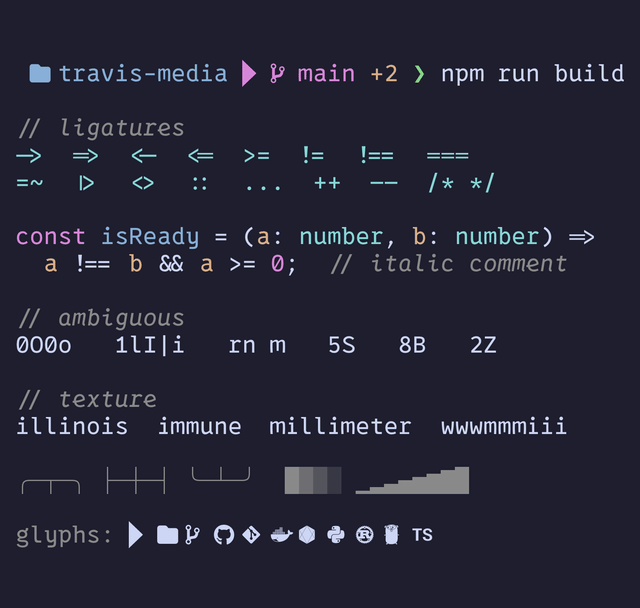
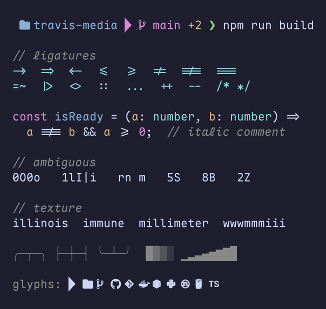
So I did it the other way. Every screenshot below is the same terminal, at the same size, in the same color scheme, showing the exact same content. Each line is there to expose one specific thing:
- A Git prompt with folder and branch icons, so you can see whether the glyphs render at all.
- A row of operators (
->,=>,!==,>=,|>), so you can see which fonts ligate them. - A TypeScript snippet whose comment is set in italic, which is the only way the cursive italics in VictorMono and CaskaydiaCove ever show up.
- The characters people confuse:
0O0o,1lI|i,rnnext tom,5S,8B,2Z. - Words that put narrow letters beside wide ones (
illinois,immune,millimeter), which is where texture healing either evens out the rhythm or does not. - Box drawing and block characters, the stuff lazygit, btop and tmux borders are built from.
- A row of devicons, since glyph coverage is the entire point of a Nerd Font.
The only thing that changes from shot to shot is the font. Whatever looks different is the font, not the setup.
Every font here is free and installs with one Homebrew command. All twelve are patched Nerd Fonts, so your prompt icons and file glyphs actually render instead of showing up as those little empty boxes.
The side-by-side comparison sheet
Here is all twelve on one page first: the same prompt line and the same code line, stacked. Save it, zoom in, and pick your two or three finalists. That will take you less time than reading the rest of this post, and I will not be offended.
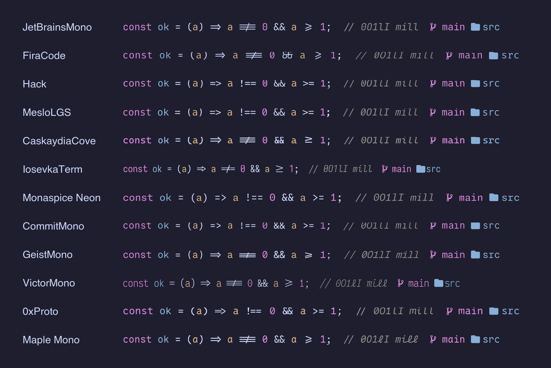
Click it to open the full-resolution version. On a phone the individual rows get small, so it is worth opening full size and pinching in on the operators.
Install once, no tap needed
Font casks used to live in a separate homebrew/cask-fonts tap. That tap was folded into the main Homebrew cask repo back in 2024, so if you are still copying brew tap homebrew/cask-fonts from an old blog post, drop it. It does nothing now.
Installing any font on this list is one line:
brew install --cask font-jetbrains-mono-nerd-fontWant to try all twelve and delete the losers? Paste this:
brew install --cask \
  font-jetbrains-mono-nerd-font \
  font-fira-code-nerd-font \
  font-hack-nerd-font \
  font-meslo-lg-nerd-font \
  font-caskaydia-cove-nerd-font \
  font-iosevka-term-nerd-font \
  font-monaspice-nerd-font \
  font-commit-mono-nerd-font \
  font-geist-mono-nerd-font \
  font-victor-mono-nerd-font \
  font-0xproto-nerd-font \
  font-maple-mono-nf
That is a few hundred megabytes of fonts, so uninstall the ones you do not keep with brew uninstall --cask font-whatever. On Linux, grab the release archives straight from the Nerd Fonts downloads page and drop the .ttf files in ~/.local/share/fonts, then run fc-cache -fv.
The three variants, and which one you want
This trips people up constantly, so it is worth thirty seconds. Nerd Fonts (currently on v3.4.0) ships every patched family in three flavors, and the download or cask usually installs all three:
- Nerd Font (
JetBrainsMono Nerd Font): icon glyphs are double-width. This is what you want in a terminal. Icons get room to breathe and the grid stays intact. - Nerd Font Mono (
JetBrainsMono Nerd Font Mono): icons are squeezed into a single cell. Use this when something insists on strict single-width cells, most commonly VS Code, where the plain variant can make icons look clipped or overlapping. - Nerd Font Propo (
JetBrainsMono Nerd Font Propo): proportional spacing. Fine for a UI, wrong for a terminal.
Rule of thumb: plain Nerd Font in the terminal, Nerd Font Mono in your editor if icons look wrong there.
After installing a font and setting it in your terminal, run this in Zsh (Zsh’s echo expands the escapes on its own). If you get four icons instead of four empty boxes, you are good:
echo "\ue0b0 \uf07b \ue725 \uf09b"
That is a Powerline separator, a folder, a Git branch, and the GitHub logo. Those four cover most of what a prompt or a file listing will throw at you.
1. JetBrainsMono Nerd Font
This is the one I actually run, and it is the pick I give anyone who does not want to think about it. JetBrains built the base font for people staring at code for eight hours, and it shows: the x-height is unusually tall, so lowercase letters fill more of each cell, and 0 O l 1 I are impossible to confuse. Ligatures are on and tasteful.
If you read nothing else on this list, install this one and get back to work.
brew install --cask font-jetbrains-mono-nerd-fontFamily name: JetBrainsMono Nerd Font · Ligatures: yes · Best for: everyone, by default
2. FiraCode Nerd Font
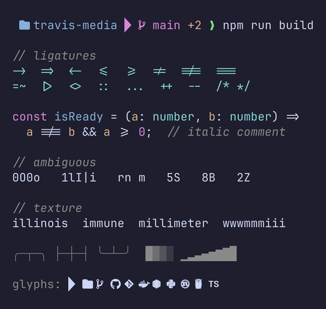
Fira Code is the font that made programming ligatures mainstream, and it still has the biggest and most polished ligature set out there. => becomes a real arrow, !== becomes one clean glyph, >= stops looking like two characters that happen to be neighbors. If you write a lot of TypeScript or Rust, the operator-heavy lines really do get easier to scan.
The catch is that ligatures are a taste thing and some people hate them. Try it for a week before you decide.
brew install --cask font-fira-code-nerd-fontFamily name: FiraCode Nerd Font · Ligatures: yes, the most of any font here · Best for: operator-heavy code and ligature fans
3. Hack Nerd Font
Hack is the anti-ligature font. Nothing combines, nothing transforms, and every character on screen is exactly the character in the file. The letterforms are boring in the best possible way, and it holds up at small sizes better than almost anything else here.
I keep coming back to it when I am reading unfamiliar code and want zero cleverness between me and the bytes.
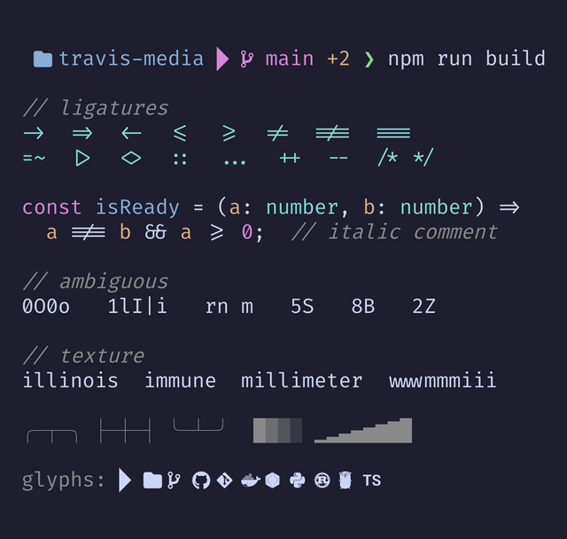
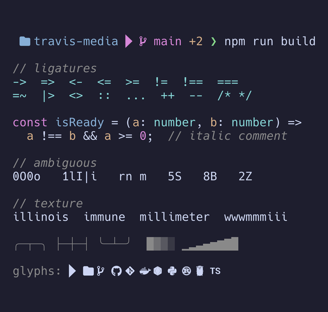
One thing the screenshot shows that I did not expect: Hack’s box-drawing characters do not join cleanly. Look at the corners and T-joints in the sample below and you will see small gaps where the lines should meet. If you live in lazygit, btop, or a heavily bordered tmux setup, that is worth knowing before you commit to it.
brew install --cask font-hack-nerd-fontFamily name: Hack Nerd Font · Ligatures: none · Best for: maximum legibility, people who find ligatures annoying
4. MesloLGS Nerd Font
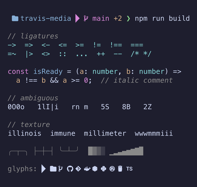
If you use Powerlevel10k, you already know this name, because the p10k configuration wizard asks you to install it and will nag you until you do. It is a Menlo derivative with adjusted line height and glyph spacing, and it renders Powerline separators cleaner than nearly anything else, which is exactly why p10k standardized on it.
Even if you never touch p10k, it is a solid, safe, slightly-wider-than-average terminal font. It pairs well with almost every Oh My Zsh theme that uses Powerline segments.
brew install --cask font-meslo-lg-nerd-fontFamily name: MesloLGS Nerd Font (the cask also installs LGM and LGL width variants) · Ligatures: none · Best for: Powerlevel10k, Powerline prompts
5. CaskaydiaCove Nerd Font (Cascadia Code)
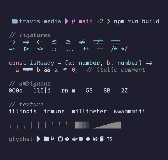
Cascadia Code is Microsoft’s terminal font, and the patched Nerd Font build is named CaskaydiaCove, which is why searching for “Cascadia Nerd Font” in Homebrew gets you nowhere. It has ligatures, a nice cursive italic, and a slightly rounded feel that holds up well on Windows-style rendering.
If you bounce between a Mac and a Windows machine and want one font that looks right on both, this is the strongest candidate on the list.
brew install --cask font-caskaydia-cove-nerd-fontFamily name: CaskaydiaCove Nerd Font · Ligatures: yes, plus cursive italics · Best for: cross-platform consistency, Windows Terminal and WSL users
6. Iosevka Term Nerd Font
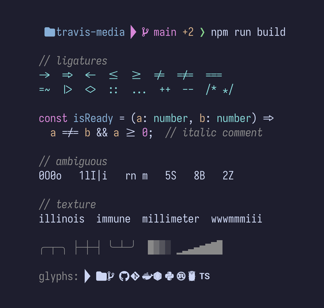
Iosevka is narrow. Not “slightly condensed,” but genuinely narrow, which means you fit noticeably more columns on screen at the same point size. If you run a tiling setup with three or four panes, or you keep a terminal split next to your editor, that extra width per pane is real value.
Note the term in the cask name. Iosevka ships in Default, Term, and Fixed spacings, and Term is the one tuned for terminals. Fixed drops the ligatures entirely if you want that.
brew install --cask font-iosevka-term-nerd-fontFamily name: IosevkaTerm Nerd Font (one word, no space, this one trips people up) · Ligatures: yes · Best for: tiling window managers, split panes, small screens
7. Monaspice Nerd Font (Monaspace)
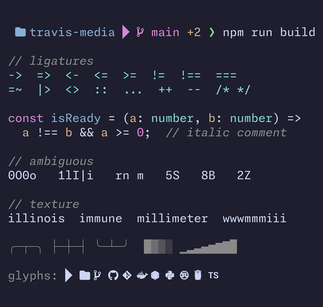
GitHub Next’s Monaspace is the most interesting font on this list. It is a superfamily of five styles designed to be mixed (Neon is the neo-grotesque default, Argon is humanist, Xenon is a slab serif, Radon is handwritten, and Krypton is mechanical), and the idea is that you assign different styles to comments, strings, and code.
Its headline feature is texture healing: when a wide character like m sits next to a narrow one like i, the font quietly redistributes the space so the line stops looking lumpy, all while staying on the monospaced grid. It needs calt enabled to work, which most terminals do by default.
The Nerd Font patch names it Monaspice, not Monaspace, so pick the style you want by its family name.
brew install --cask font-monaspice-nerd-fontOne thing that surprised me while shooting the screenshots for this post: Monaspace’s ligatures are off by default. They ship in stylistic sets rather than in the usual liga/calt features, so a stock terminal renders => and !== as plain characters. Turning on calt does nothing for them. You have to ask for the sets by name. In Ghostty:
font-family = MonaspiceNe Nerd Font
font-feature = ss01, ss02, ss03, ss04, ss05, ss06, ss07, ss08, ss09
Family names: MonaspiceNe Nerd Font (Neon), MonaspiceAr (Argon), MonaspiceXe (Xenon), MonaspiceRn (Radon), MonaspiceKr (Krypton) · Ligatures: yes, but off until you enable the stylistic sets · Best for: people who want to nerd out on typography
8. CommitMono Nerd Font
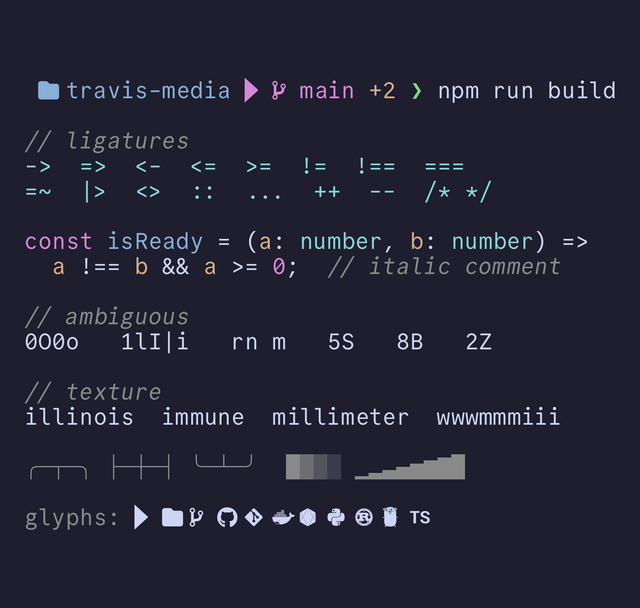
Commit Mono calls itself an “anonymous” typeface, and that is a fair description. It is deliberately neutral, with no personality trying to get your attention, which is exactly what a lot of people want from something they stare at all day. It uses smart kerning to balance spacing without breaking the mono grid.
Like Monaspace, its ligatures are off out of the box, and enabling calt will not bring them back. I tested this: calt on its own renders => and !== as plain characters, and only the stylistic sets switch them on.
font-family = CommitMono Nerd Font
font-feature = ss01, ss02, ss03
brew install --cask font-commit-mono-nerd-fontFamily name: CommitMono Nerd Font · Ligatures: yes, but off until you enable the stylistic sets · Best for: a quiet, neutral font that gets out of the way
9. GeistMono Nerd Font
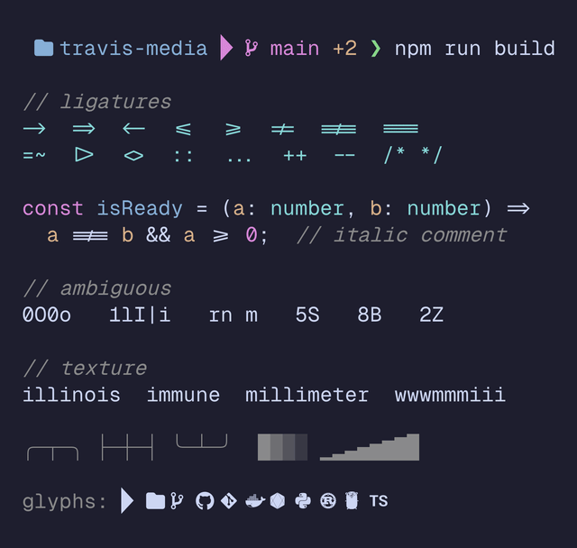
Geist Mono is Vercel’s monospace font, and it looks like it: geometric, tight, and a little bit fashionable. This is the font that makes your terminal screenshots look like a product landing page. It reads well at larger sizes, so it is a good pick if you record screencasts, though it gets a bit thin and sparse at 12pt on a small display.
brew install --cask font-geist-mono-nerd-fontFamily name: GeistMono Nerd Font · Ligatures: yes · Best for: screenshots, demos, and modern minimal setups
10. VictorMono Nerd Font
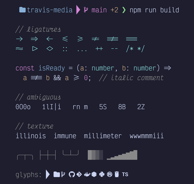
Victor Mono’s calling card is its semi-connected cursive italic. Set your comments and keywords to italic in a Neovim or VS Code theme, and they turn into handwriting while the code stays upright. It is slim and narrow with a large x-height, so it is legible, but the cursive is the reason to install it.
This is a polarizing pick. You either open it and immediately want it everywhere, or you find the italics distracting. There is not much middle ground.
brew install --cask font-victor-mono-nerd-fontFamily name: VictorMono Nerd Font · Ligatures: yes, plus cursive italics · Best for: Neovim and VS Code themes that italicize comments
11. 0xProto Nerd Font
0xProto takes a strong position: it refuses to use ligatures that change what a character means. != stays as != rather than collapsing into a ≠ glyph, on the reasoning that code should look like what it is, especially when part of a line is scrolled off or hidden. What it does include is character disambiguation work on l 1 I, wide interior counters so it stays readable at small sizes, and texture healing to even out the spacing.
Think of it as Hack’s philosophy with a decade of newer type design behind it.
brew install --cask font-0xproto-nerd-fontFamily name: 0xProto Nerd Font · Ligatures: no meaning-altering ones, by design · Best for: people who want texture healing without ligature magic
12. Maple Mono NF
Maple Mono is the newest font on this list and the one people keep recommending to me unprompted. It is rounded and open, with a huge ligature set and cursive italics. The project ships its own Nerd Font build, so the cask name breaks the pattern: it is font-maple-mono-nf, not font-maple-mono-nerd-font.
If JetBrains Mono feels a little corporate to you, this is the friendlier version of the same idea.
brew install --cask font-maple-mono-nfFamily name: Maple Mono NF · Ligatures: yes, plus cursive italics · Best for: a warmer, rounder alternative to JetBrains Mono
Honorable mentions
Three more that did not make the twelve but are worth a look:
- SauceCodePro Nerd Font (
font-sauce-code-pro-nerd-font) is the patched Source Code Pro. Adobe’s classic, still excellent, just not exciting. - BlexMono Nerd Font (
font-blex-mono-nerd-font) is IBM Plex Mono patched. Beautiful, a bit wide. - DepartureMono Nerd Font (
font-departure-mono-nerd-font) is a pixel/bitmap-style retro font. Impractical for daily work, extremely fun for a themed setup.
How to actually set the font
Installing the font does nothing on its own. You have to point your terminal at it, using the family name (the bolded name in each section above), not the cask name.
Ghostty (~/.config/ghostty/config):
font-family = JetBrainsMono Nerd Font
font-size = 14
WezTerm (~/.wezterm.lua):
config.font = wezterm.font('JetBrainsMono Nerd Font')
config.font_size = 14
Kitty (~/.config/kitty/kitty.conf):
font_family      JetBrainsMono Nerd Font
font_size        14.0
iTerm2: Settings, then Profiles, then Text, then Font. Pick it from the dropdown and check “Use ligatures” if you want them.
VS Code (settings.json), where you usually want the Mono variant:
{
  "editor.fontFamily": "JetBrainsMono Nerd Font Mono",
  "editor.fontLigatures": true,
  "terminal.integrated.fontFamily": "JetBrainsMono Nerd Font"
}
If a font refuses to load, the family name is almost always the culprit. Get the exact string straight from your system instead of guessing:
# macOS or Linux, with fontconfig installed
fc-list | grep -i jetbrains

# macOS without fontconfig: just open Font Book and read the family nameSo which one should you pick?
If you want the short version:
- Just tell me what to install: JetBrainsMono Nerd Font. It is my daily driver and it is the right answer for most people.
- You love ligatures: FiraCode Nerd Font.
- You hate ligatures: Hack Nerd Font, or 0xProto if you want something more modern.
- You use Powerlevel10k: MesloLGS Nerd Font, because p10k is going to ask for it anyway.
- You need more columns on screen: Iosevka Term Nerd Font.
- You want your comments in cursive: VictorMono Nerd Font.
Honestly, the font matters less than committing to one. Install two or three, live in each for a week, and then stop thinking about it. The people who tinker with their font every month are not shipping more code than the people who picked Hack in 2019 and never looked back.
Once your font is sorted, the rest of the terminal is worth the same treatment. I put my actual setup in Top 10 Terminal Tools I Actually Use Daily, and if your prompt still feels bare, the Oh My Zsh plugins post covers what to bolt on next.
Nerd Fonts FAQ
What is a Nerd Font, exactly?
A Nerd Font is a normal programming font that has been patched to include thousands of extra icon glyphs from sets like Font Awesome, Devicons, Octicons, Material Design Icons, and Powerline. Those glyphs are what let your prompt show a Git branch icon or a folder icon instead of an empty box. The font itself is unchanged; the icons are added on top.
Do I need a Nerd Font for Powerlevel10k or Starship?
Effectively, yes. Both prompts use icon glyphs by default, and without a patched font you will see boxes and question marks where the icons should be. Powerlevel10k specifically recommends MesloLGS Nerd Font and its setup wizard will offer to install it for you.
Why do my icons look squished or overlapping?
You are probably using the wrong variant. The plain Nerd Font build renders icons at double width, which terminals handle well but some editors do not. If icons look clipped in VS Code, switch the editor font to the Nerd Font Mono variant, which fits every icon into a single cell.
Do ligatures slow down my terminal?
Not in any way you will notice on modern hardware and modern terminals like Ghostty, WezTerm, or Kitty. Ligatures are a rendering feature, not a performance problem. If you turn them off, do it because you dislike how they look, not to chase speed.
Can I install Nerd Fonts without Homebrew?
Yes. Download the release archive for the font you want from nerdfonts.com, unzip it, and install the .ttf files. On macOS you can double-click them or drop them in ~/Library/Fonts. On Linux, copy them to ~/.local/share/fonts and run fc-cache -fv to refresh the font cache.
This page may contain affiliate links. Please see my affiliate disclaimer for more info.